DePaul Buy & Sell
Ross Dillon, Jiyoun Jun, and Brandon Lawler
October-November 2019
Overview
Every quarter DePaul students are required to buy textbooks and school supplies for their classes or their own needs. Our user study sought to look into how students buy, rent, and get rid of their textbooks and other school-related materials. The goal of this project is to design an innovative application that will help positively impact the experience of DePaul students when it comes to finding and getting rid of textbooks and school materials
My Role
Project Lead. This was a collaborative effort between the three of us. I acted as Project Lead assuring that we were doing the work, meeting deadlines, and helping set agendas for meetings. Overall, we were all involved in user experience design, conducting user testing, research, and documentation.
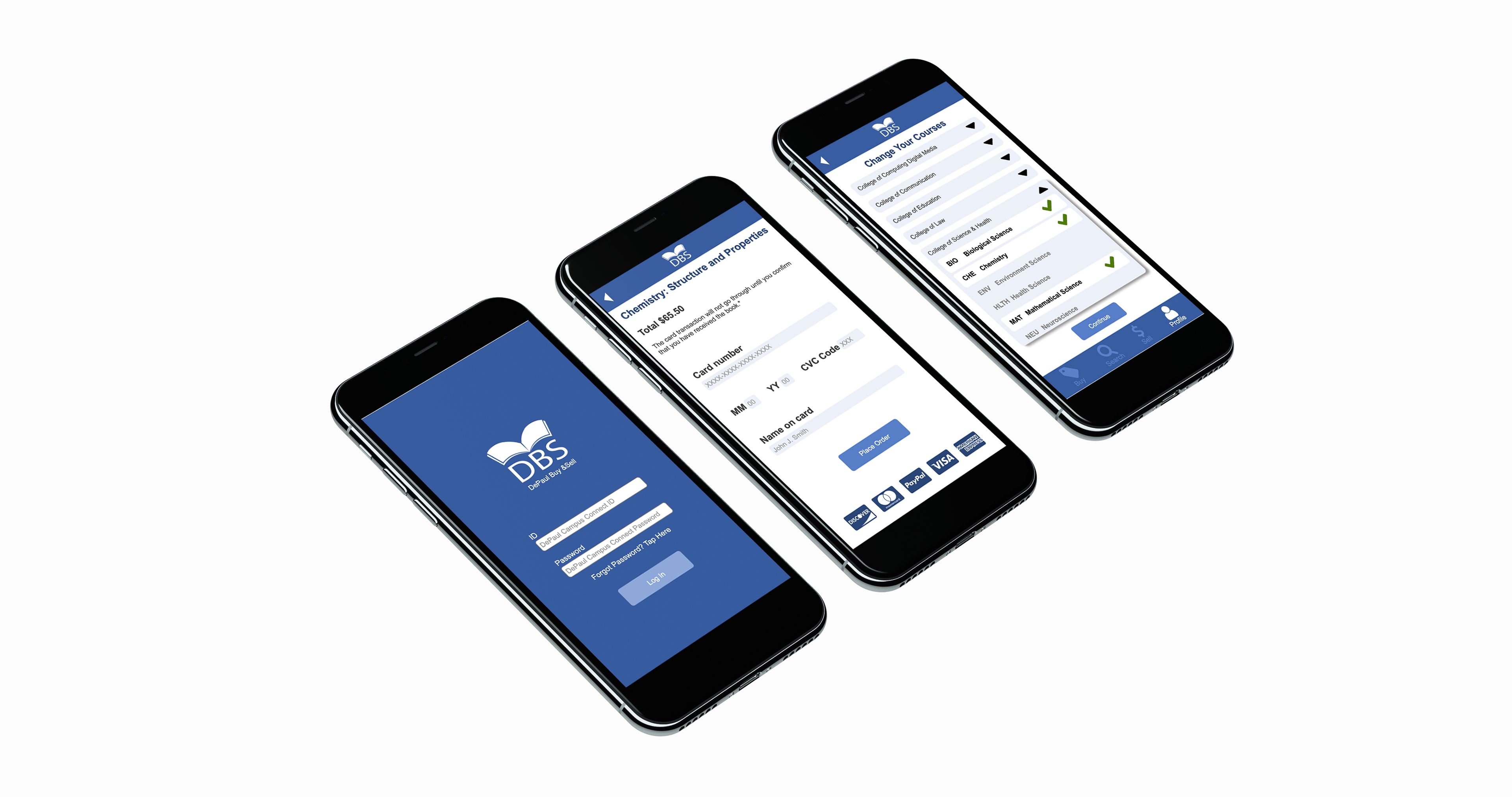
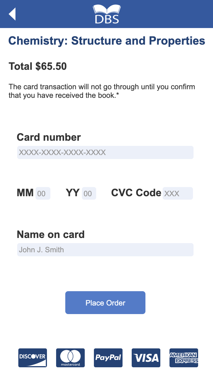
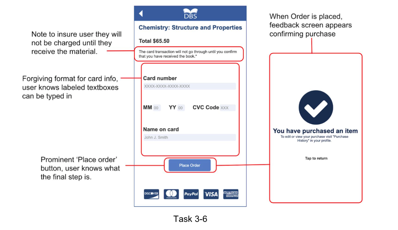
High fidelity prototype rendering on iPhone X
The Challenge
Design an innovative app. When we started brainstorming ideas on what DePaul Students need, we realized many students complain about school material prices and also have old materials sitting around their houses. Our goal was to create an innovative tool that can impact the experience of DePaul students in buying and selling these used school materials. The challenge was to research test and design.
The App
The DePaul Buy & Sell app allows students to buy and sell school materials from one another in a peer-to-peer solution that helps students get material on time, reduce waste, and save money.
Research
We each conducted several interviews with DePaul Students as well as a competitive analysis. With the data collected, we did affinity sorting to arrive at important insights which we turned into design principles. Leading to concepts, storyboards, scenarios, and eventually user stories.
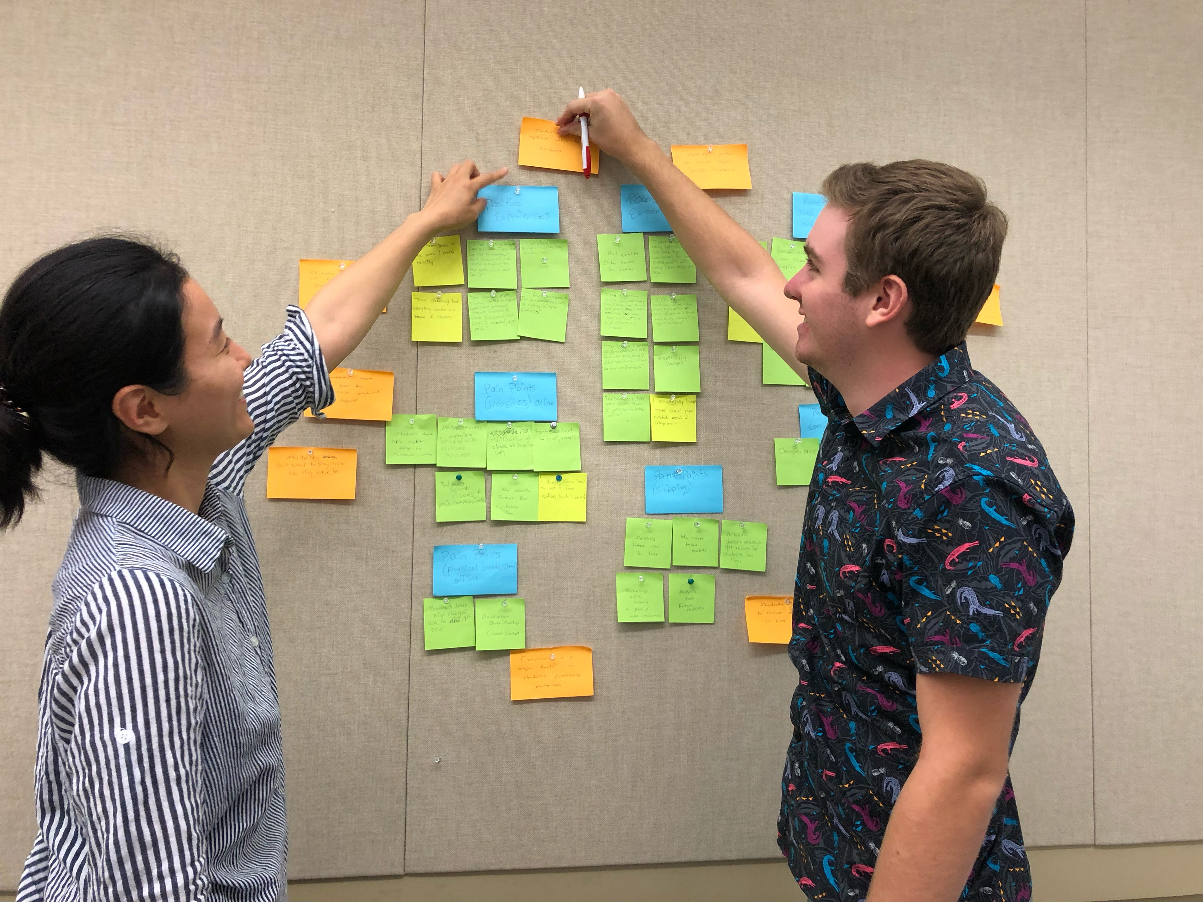
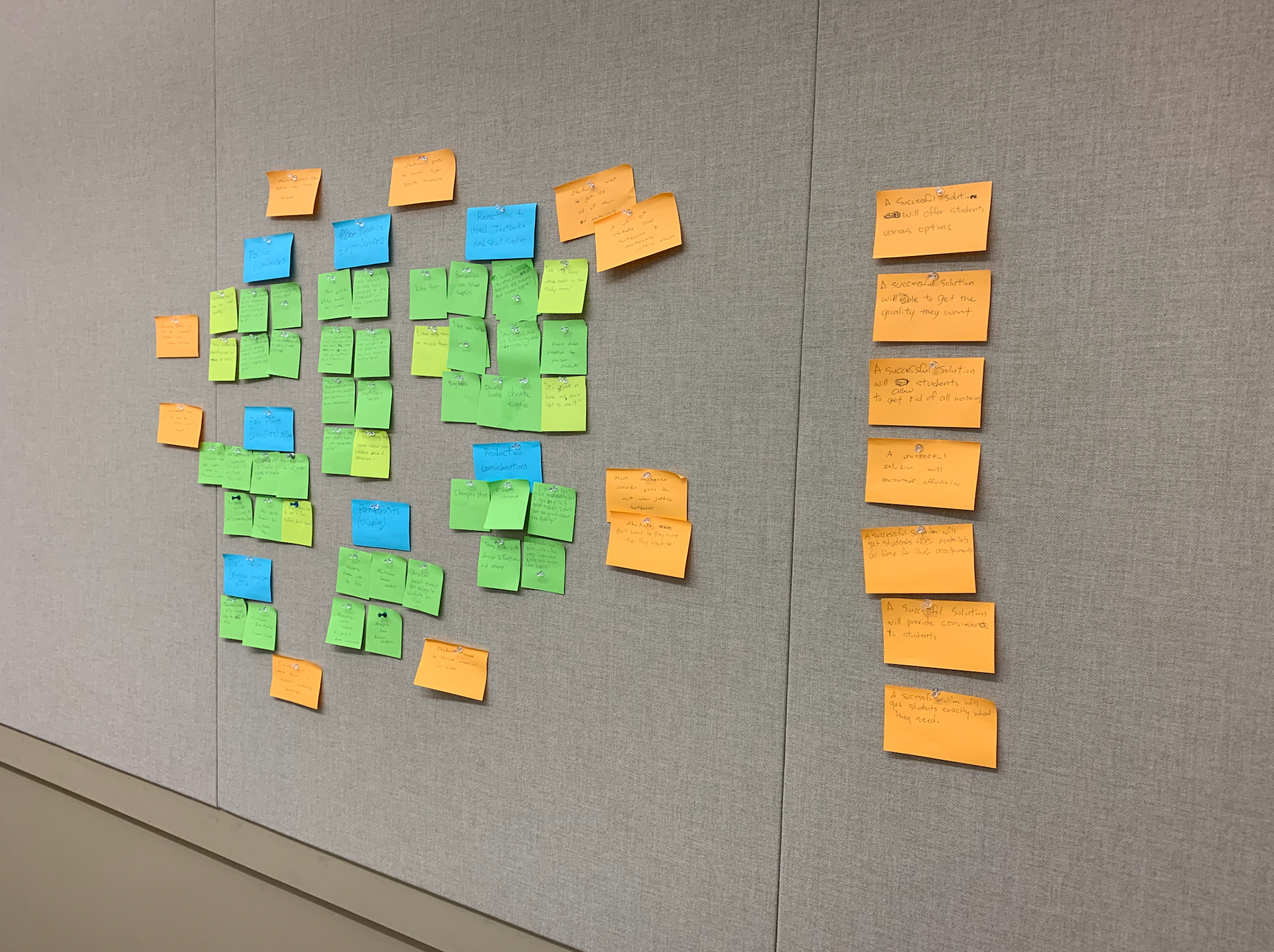
Jiyoun and I affinity sorting data collected from research
Important Research Insight (What We Learned)
1. Many students consider price the most when getting textbooks
2. A lot of students have textbooks and materials sitting around
3. Students want to get rid of their old materials.
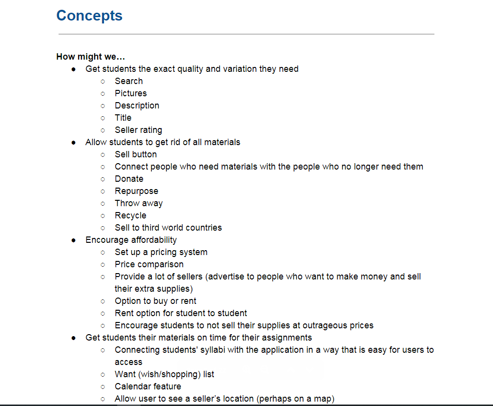
Design Principles
What will a successful solution do?
-Get students the exact quality and variation they need
-Allow students to get rid of all materials
-Encourage affordability
-Get students their materials on time for their assignments
-Provide convenience to the student
-Allow students to get rid of all materials
-Encourage affordability
-Get students their materials on time for their assignments
-Provide convenience to the student
User Stories
As a student...
-I need to be able to find the exact materials for my classes so that I can be on top of my assignments.
-I want to be able to post material listings so that I can sell my used materials.
-I want to see the cheapest options for school supplies so that I can save money.
-I want to quickly receive material so that I can have it on time for assignments.
-I want an easy process to purchase materials from my phone so that I can buy materials on the go.
-I want to know who I’m purchasing from so that I know everything is legitimate.
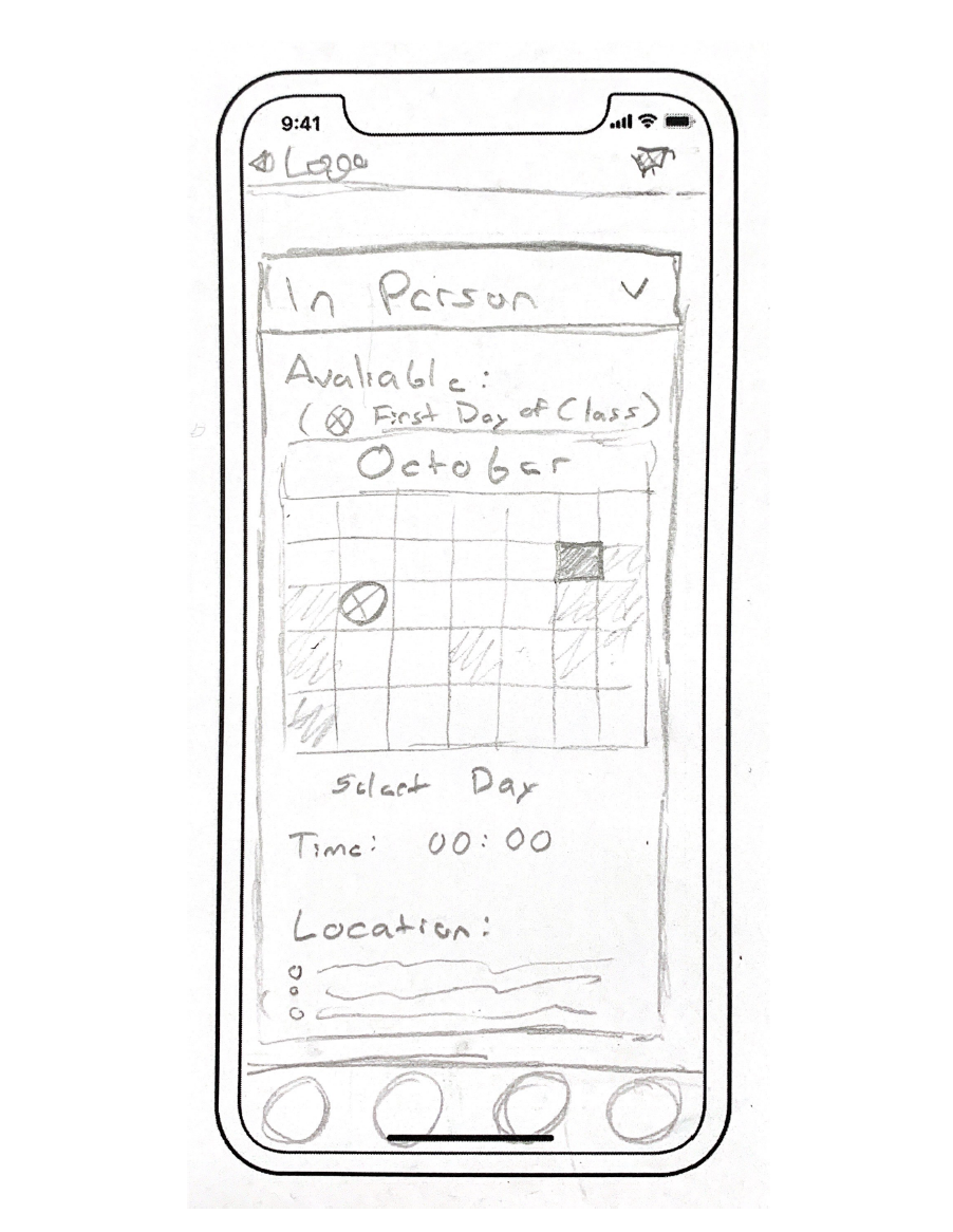
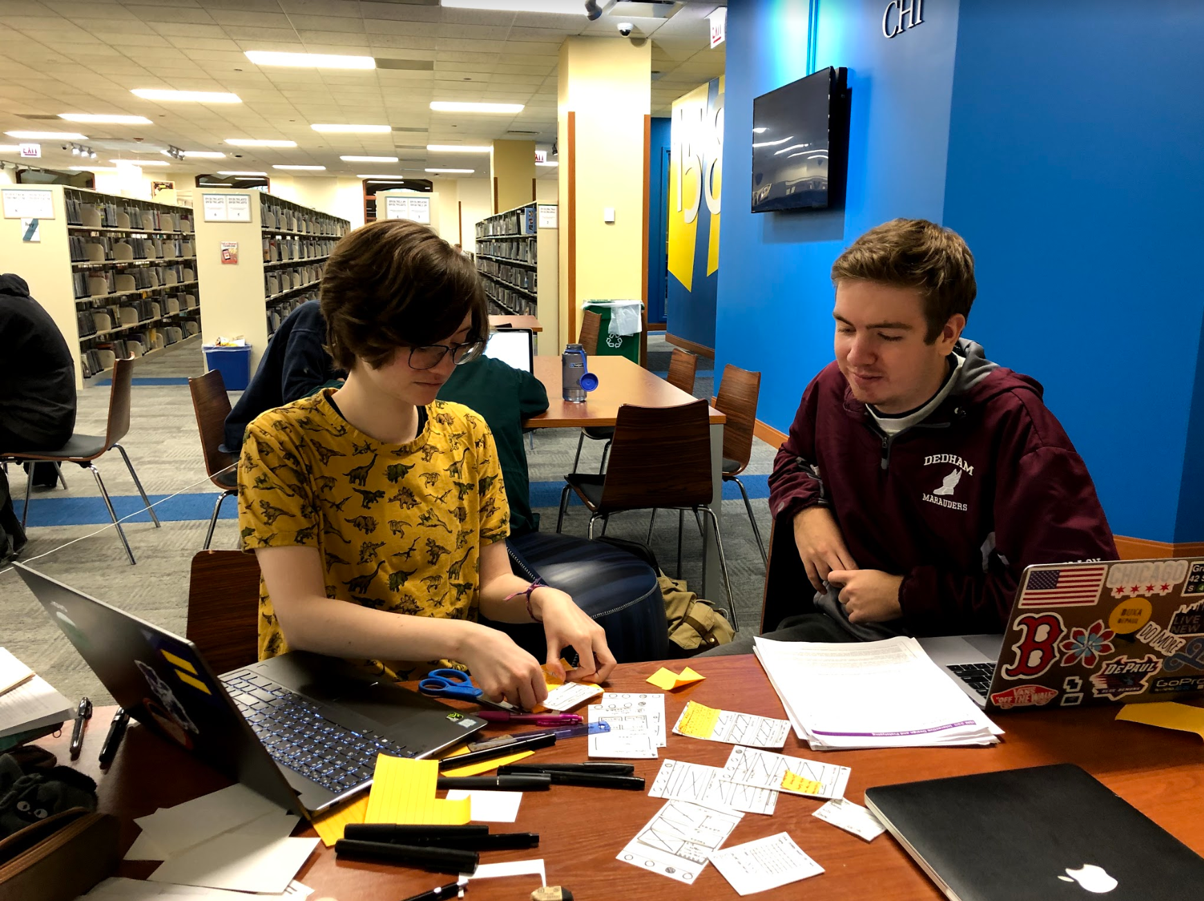
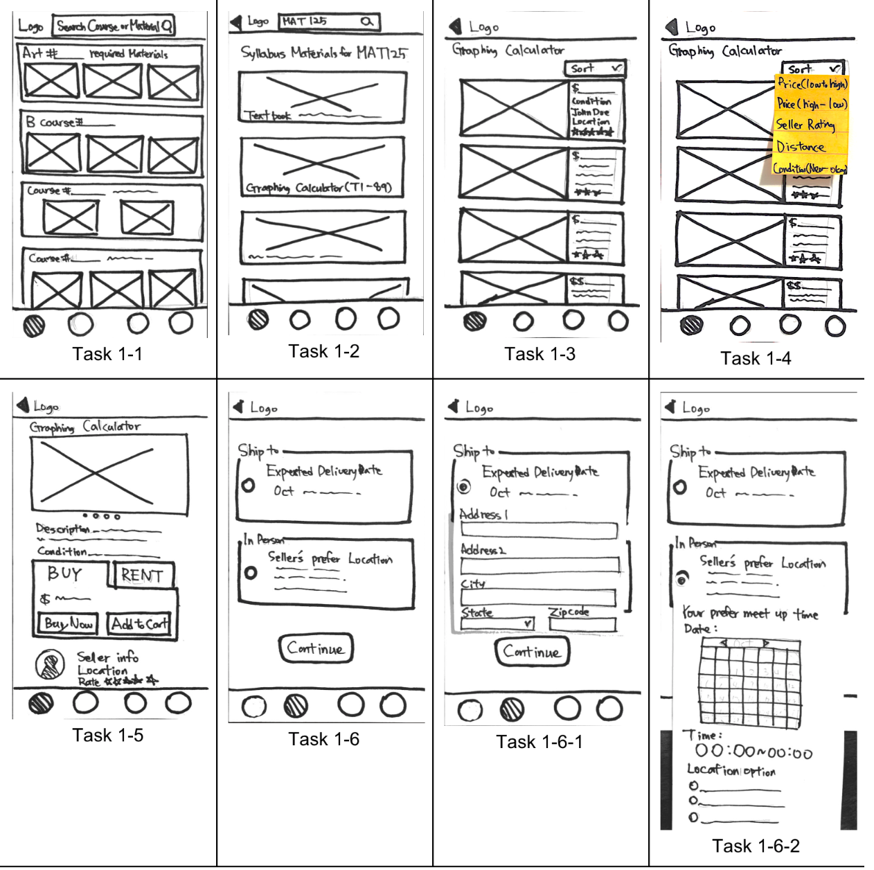
(Left) This is my interface sketch for a calendar feature that would be used during selecting a delivery or meet-up date to receive materials. (Right) My group and I began sketching paper prototypes based on our interface sketches and other concepts.
Six Best Concepts for Features
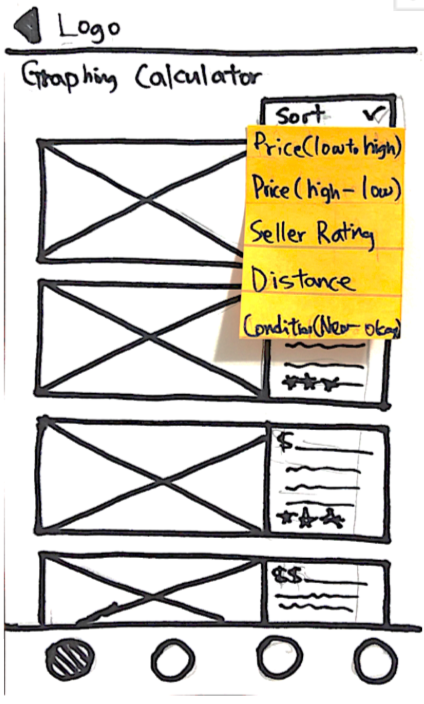
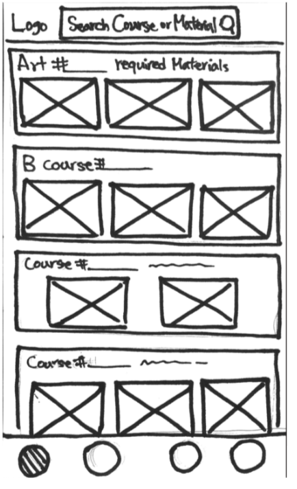
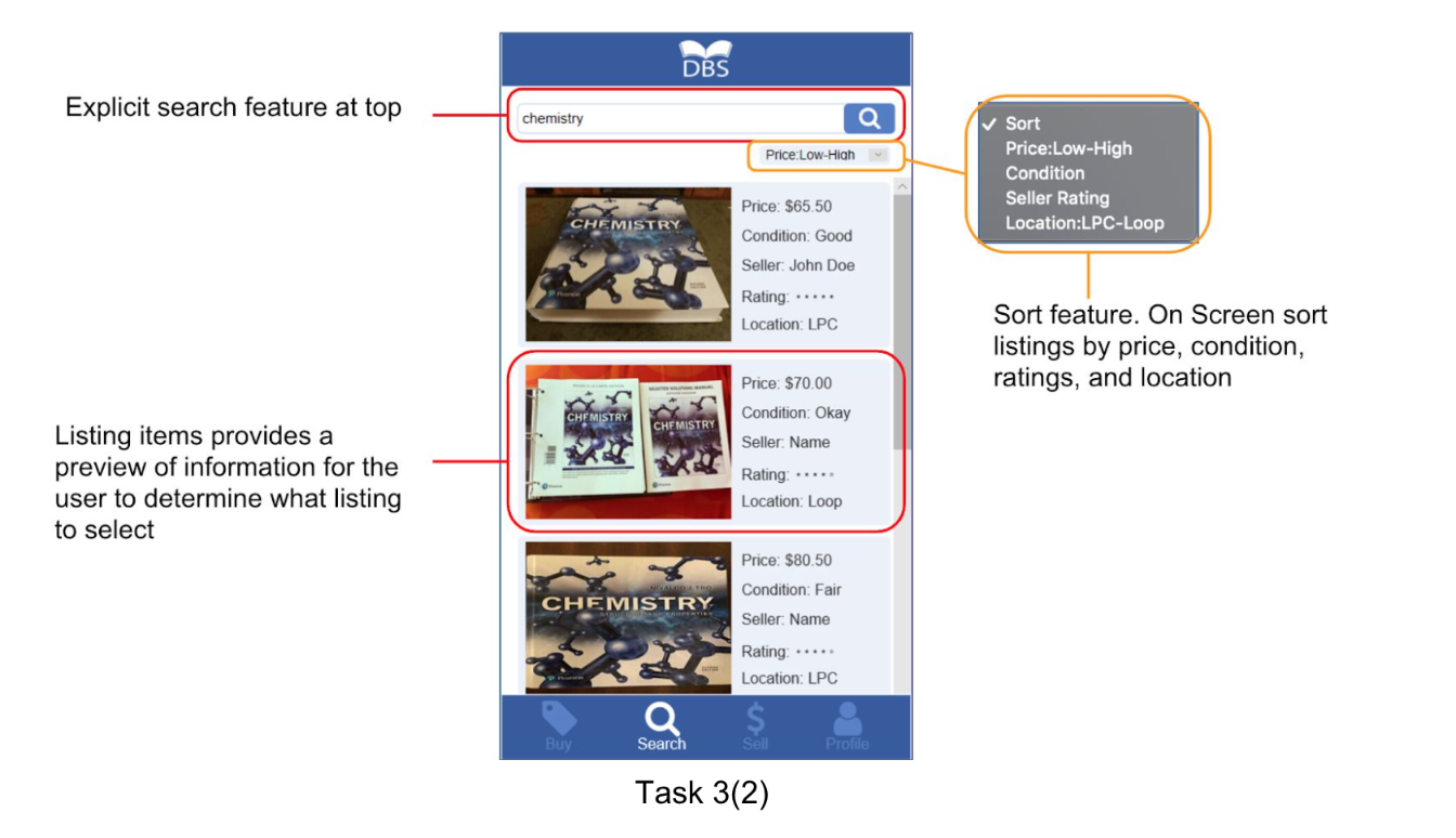
Search - filters, price, and comparison
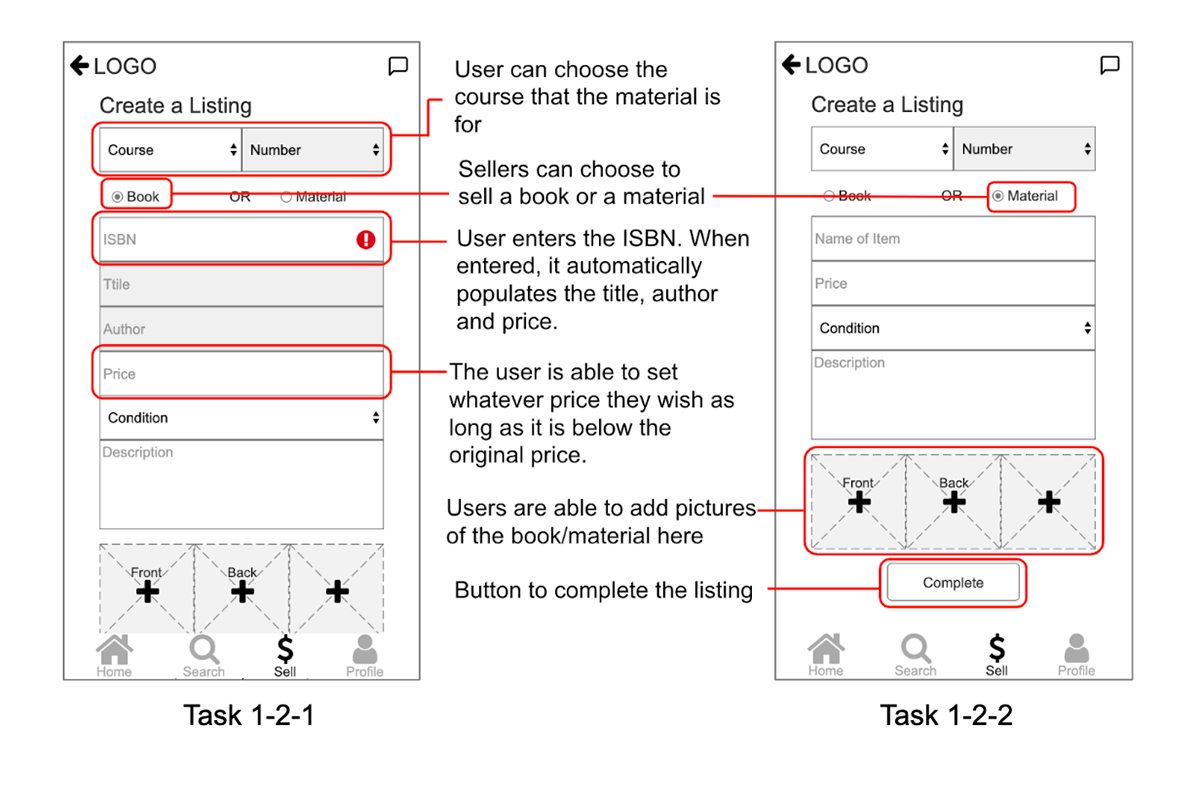
Sellers - pictures, title, author, ISBN, description (for materials)
Seller + buyer ratings / profiles
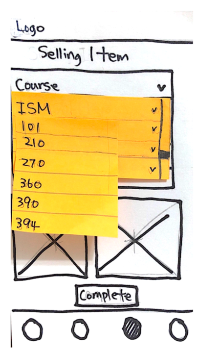
Buying process - buy / rent / shipping through delivery or in-person meet-up
Sellers - pictures, title, author, ISBN, description (for materials)
Seller + buyer ratings / profiles
Buying process - buy / rent / shipping through delivery or in-person meet-up
Syllabus feature
Calendar - when the book will get to you / tracking / when you need the book soon
Calendar - when the book will get to you / tracking / when you need the book soon
Storyboarding & Scenarios
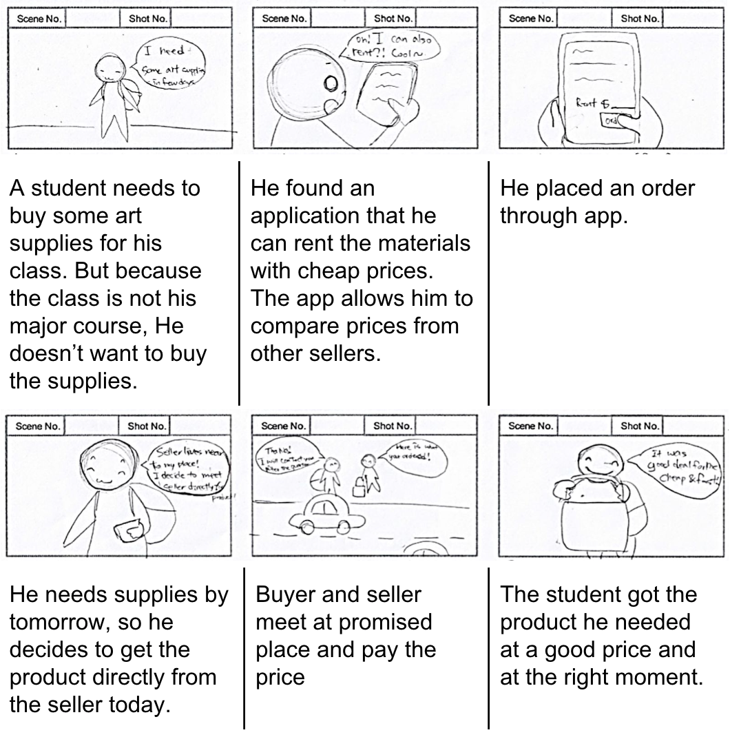
Storyboard: delivery through in-person meet-up (Refer to image on left).
Scenario: Search - filters, price comparison
Dan is going to University, he sees there is a textbook on the syllabus that his accounting teacher told him to get. He looks online, but buying the book seems too expensive. He wants an alternative to paying full price. He hears about a place where he can get textbooks and materials cheaper from other students. So he downloads the app. He wants to compare prices in the hope of finding the cheapest purchasing option, with the ability to receive the book on time. He searches for his course and clicks on the class. He then clicks on the textbook he needs and filters the options. He sorts from cheapest to highest price and can find the book at a cheaper price.
Prototyping
Paper Prototype first iteration
Prototyping Process
Our process involved a paper, mid-fidelity, and high-fidelity prototype. At each stage, we conducted user testing. We received positive feedback on the general application concept. However, through evaluations, we found a lot of flaws that were problematic to the users and recorded several different comments and interactions that would help us refine the design after each testing session.
Insights from the First Design
Overall, we observed several problems that the user had while trying to go through the two tasks.
-One of the biggest issues we found was that people were confused about the purpose and meaning of a “Buy Now” button. Some of our language and options needed to change.
-Users also wanted more information about the seller. They were confused about how the in-person delivery would work. Users thought it would be nice to see the uploaded date, view numbers (how many times the buyer searches and opens the post), and price changes.
-Users commented on the first screen. They thought it was cluttered and difficult to understand what to do at first.
-As for the second task, the main issue was that users were not sure how to add photos to the item post. They didn’t know if they could add more than two or if there were already photos there.
There were a lot of issues with the first design when it came to signifiers and input feedback, so we knew it would be important going forward.
Mid fidelity Prototype, second iteration
Insights from the Second Prototype
-Users clicked on the search icon in the navigation bar to look for their course materials instead of clicking content on the homepage.
-Users were confused about the contents of the first homepage, what was it displaying?
-Users had trouble locating the place to change their interests
-Users clicked on the “send message” button on the sort results page and had the intent to send a message to the seller before setting up a meeting.
-Several users received an error for not inputting ISBN information and were then confused as to why they could not continue (Error feedback).
It became clear our prototype still had a couple of architecture problems, we needed the user to be able to flow more easily through the software. We also needed users to understand what information must be filled in by signifying and feedback, and users needed an easy way to correct any missing inputs.
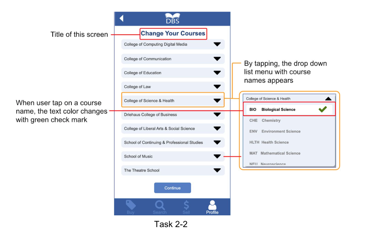
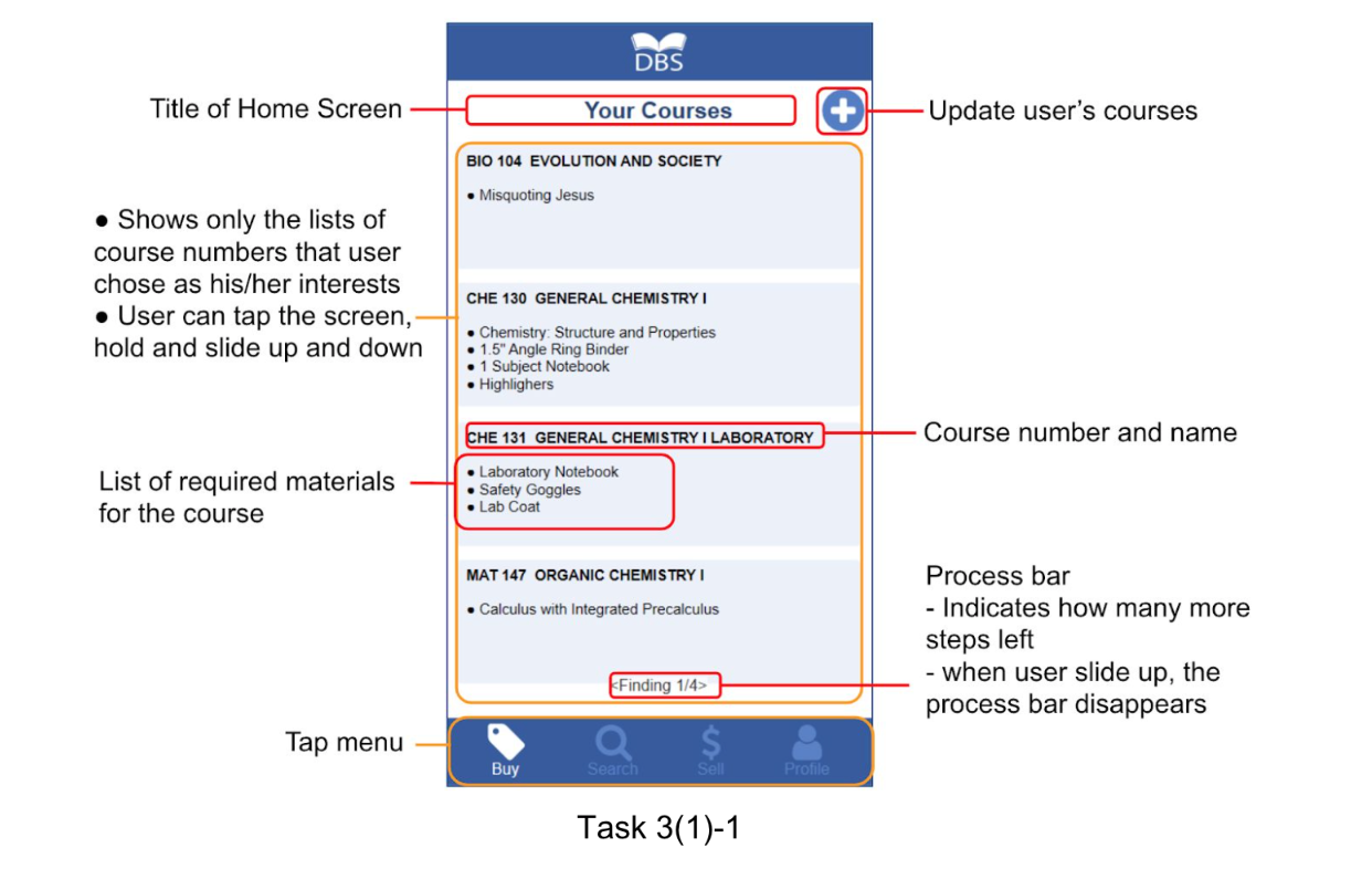
High-Fidelity Prototyping
We made our high-fidelity prototype using Axure RP 9. The program allows for functional interactivity in its wireframes, using dynamic panels, variables, and conditionals which we used to create content changes and a search feature. While designing the interactivity we utilized design patterns and usability heuristics.
User testing led us to change button locations, wording, error prevention, feedback screens, navigation layout, and much more.
Future Improvement Recommendations
-Add adaptive views
-Modify the placement of certain buttons (i.e. create a listing button)
-Fix the error messages while creating a listing
-Let the user know that the autofill pricing is the original price of the book
-Change wording on user tasks. ‘Material’ → ’Supply’, from ‘Price’ → ’Set price’, ‘Recent Post’ → ‘Recent Listings’
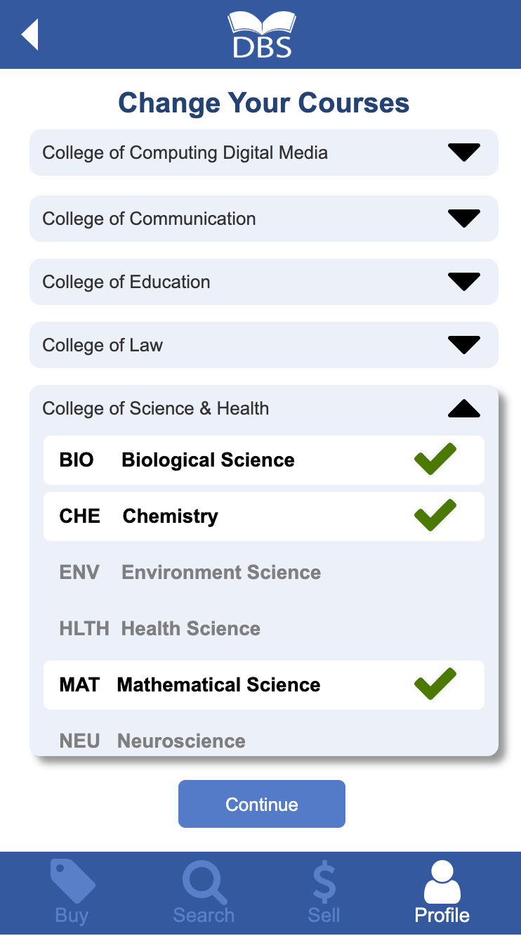
-Add a way for users to unselect pre-chosen courses
-Add a message icon somewhere for the users to check their message
-Unify the font size
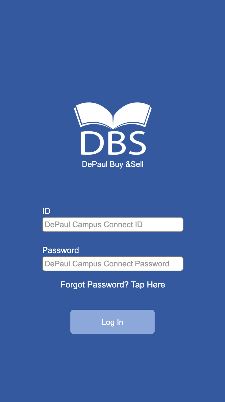
Final Prototype
High Fidelity Prototype Video Walkthrough
Description of Solution
We created an application that satisfies all design principles.
In the application, students can be sellers and buyers at the same time.
A simple app process meets a design principle and provides convenience to students.
By uploading their used items, students can get rid of their all used materials.
The more items the seller uploads, the more options the buyer has getting students the exact quality and variation they need & Encourage affordability.
By providing buyers another receiving option ‘In person meet up,’ students can get the materials on time.
Reflection
I learned a lot from this project, including how to take data and turn it into ideation like design principles, user stories, and features. I got much more comfortable facilitating user testing having facilitated a lot of them throughout the project. User feedback was super important to our design and made us critically think about how we could increase usability throughout our iterations. With only ten weeks to deliver a final prototype, it proved to be a busy schedule, but we always met our set deadlines. I gained a lot of knowledge of how to use Axure software as well. Our team worked hard together and I’m proud of the outcome in which we achieved our user stories. I am super excited to take what I learned about the design process and apply it to future work.
Appendix
Full (76 page) Documentation Here:
1. User Study and Interviews Part One
2. Concept Exploration and Paper Prototype Part Two
3. Wireframing Mid-Fidelity Prototype Part Three
4. High-Fidelity Prototype Part Four
Special Thanks to Brandon and Jiyoun, as well as all the usability testers.