Creamery Website Redesign
Ross Dillon
February-March 2020
Battenkill Valley provides northern New York with some of the richest and best tasting milk in the state. Despite their improved business their website was left behind. For a class project I chose on of my favorite creamery's websites to redesign. With the purpose of practicing my prototyping and visual design skills. My goal was to create a modern creamery website which would focus on getting customers to order fresh products online for local delivery or pickup, as well as promote the store. Achieving this through a low signal-to-noise ratio on the landing page, and a happy path for the user journey to purchase desired items.
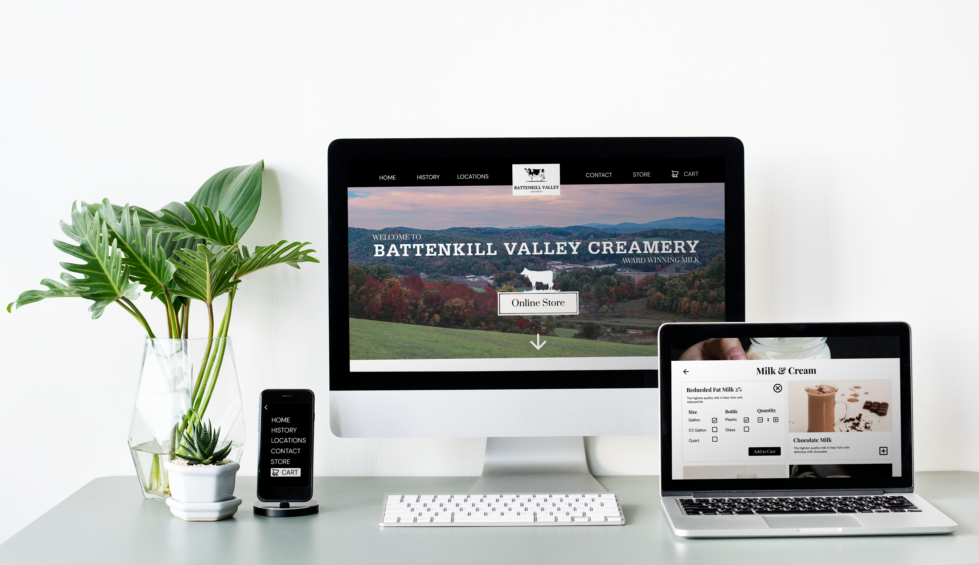
Final Design Mockup:
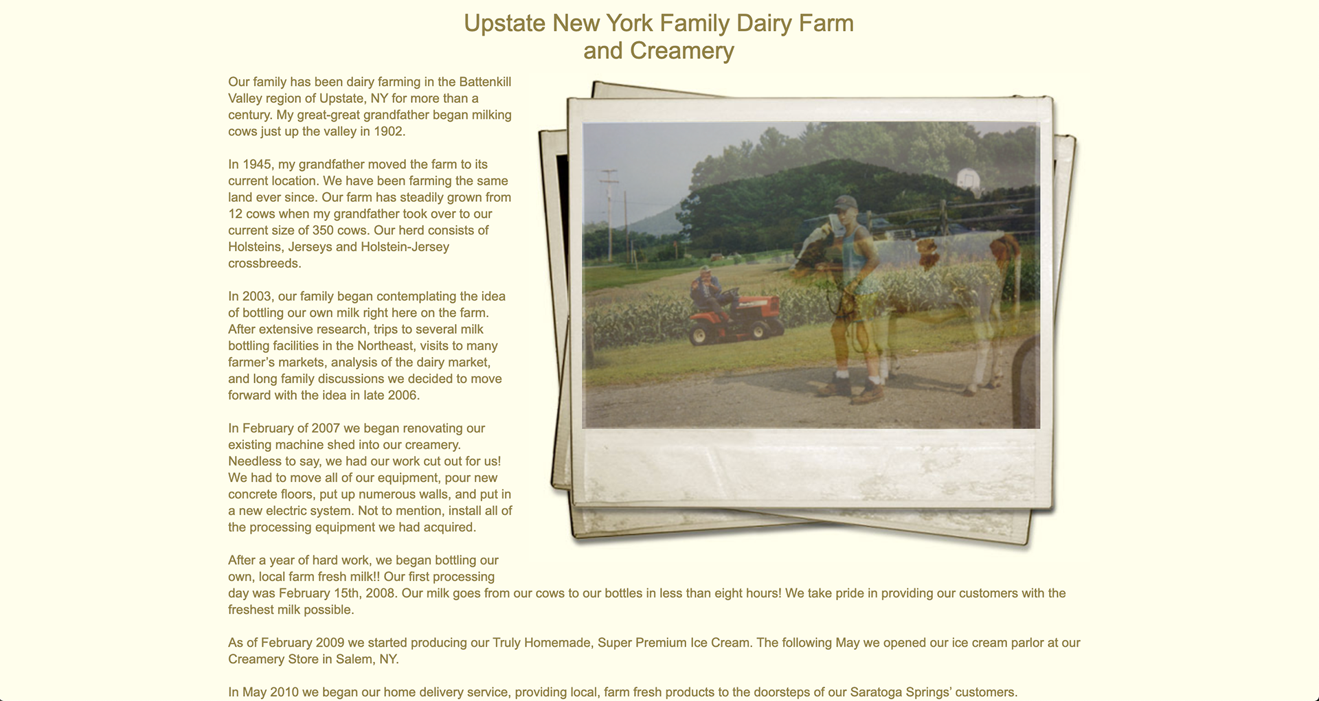
Original Website
The Creamery I designed for is famous for their high quality and delicious milk, made on a farm and creamery in northern New York. They sell milk products and ice cream. I always enjoyed drinking getting ice cream or chocolate milk when visiting my Grandmother. So I decided to do a redesign for a school project of their website.


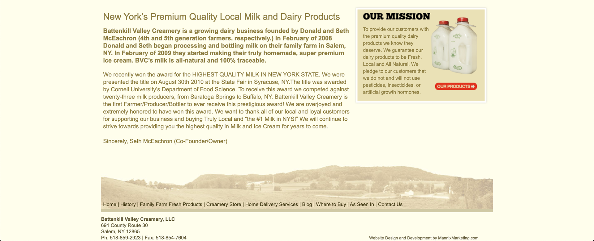
The Problem
-Website does not translate to mobile or tablet devices.
-Overall outdated feel, unnecessary decoration.
-No option for order online and pick up services.
-Carousel does not serve a function.
-Random colors and text size, poor hierarchy and cohesion.
-Poor product photography with black backgrounds.
-Yellow in color scheme doesn't match branding.
-No call to action to show a direct user path and create sales.
-Unnecessary borders around items and images.
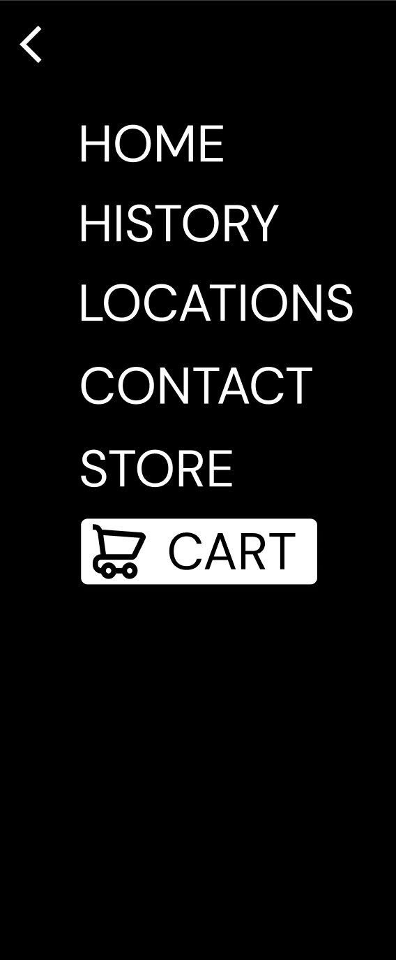
-Too many menu options, with 2 navigation bars.
-Too text heavy on many pages, readability issues.
Project Challenge & Goal
Create a modern creamery website which would focus on getting customers to order fresh products online for delivery or pickup, as well as promote the store. Achieving this through a low signal-to-noise ratio on the landing page, and a happy path for the user journey to purchase desired items.
Paper Prototype
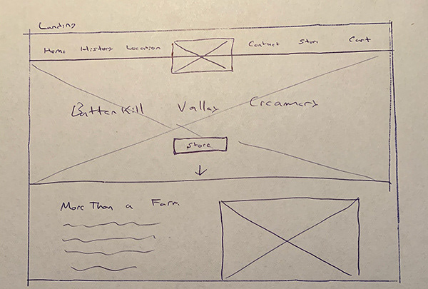
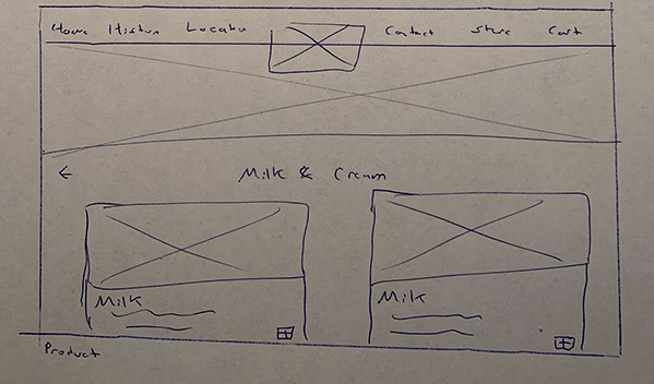
Wireframe
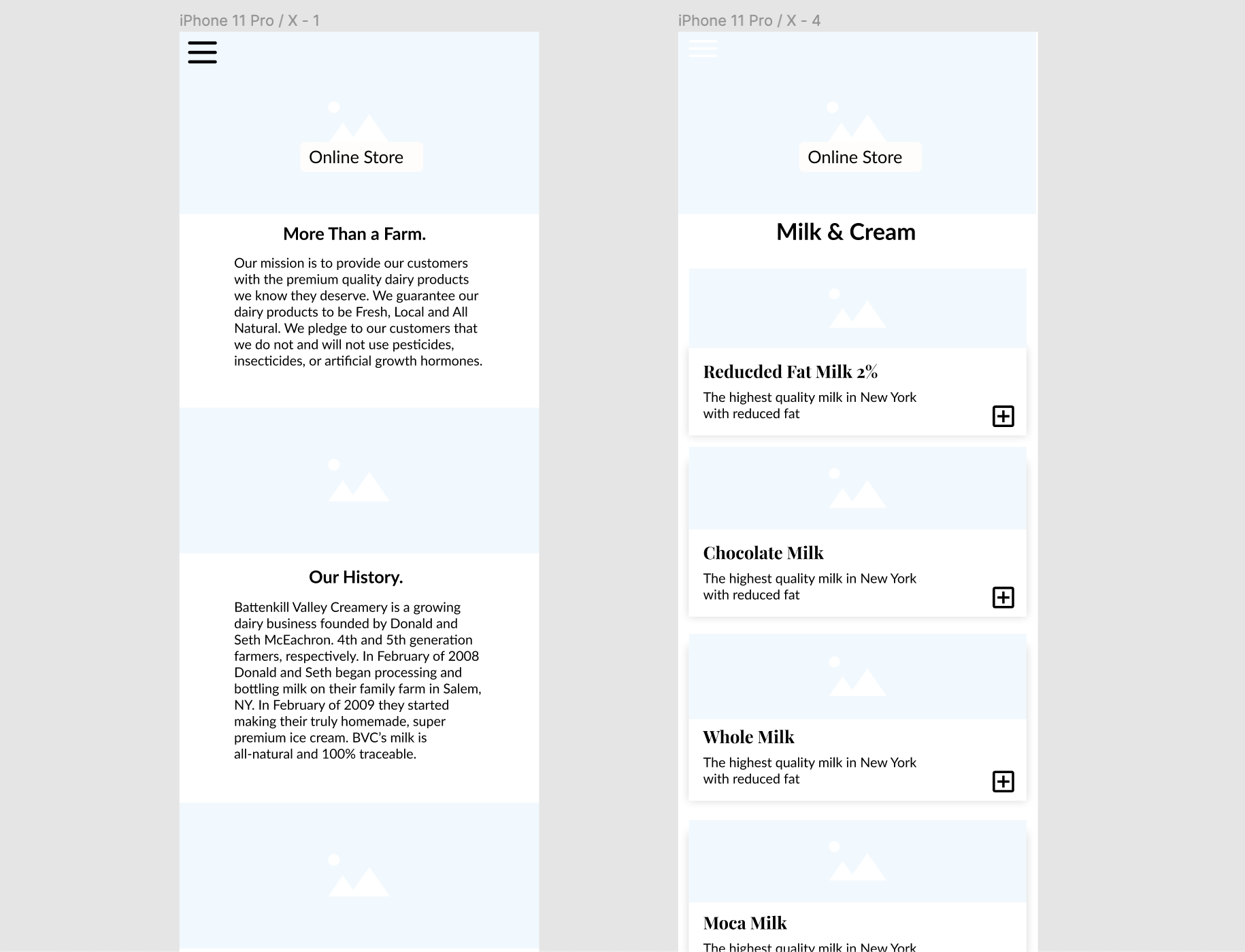
Based off some sketch ideas I had for navigation, the landing page, and a product page. I went into Figma and began drafting a wireframe with placeholder images and real copy text. I designed mobile and desktop versions alongside one another as I wanted them to have the same feel, just on seperate devices.
User Tasks
While designing early prototypes I wanted to keep in mind what tasks a customer coming to this site would be doing
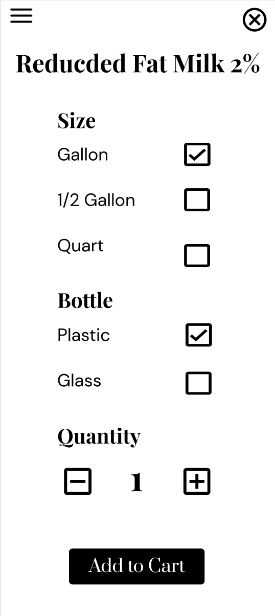
Task 1: Order a gallon of 2% milk, 2 pints of vanilla ice cream, and some chocolate milk for in store pick up.
Task 2: Find the closest store location.
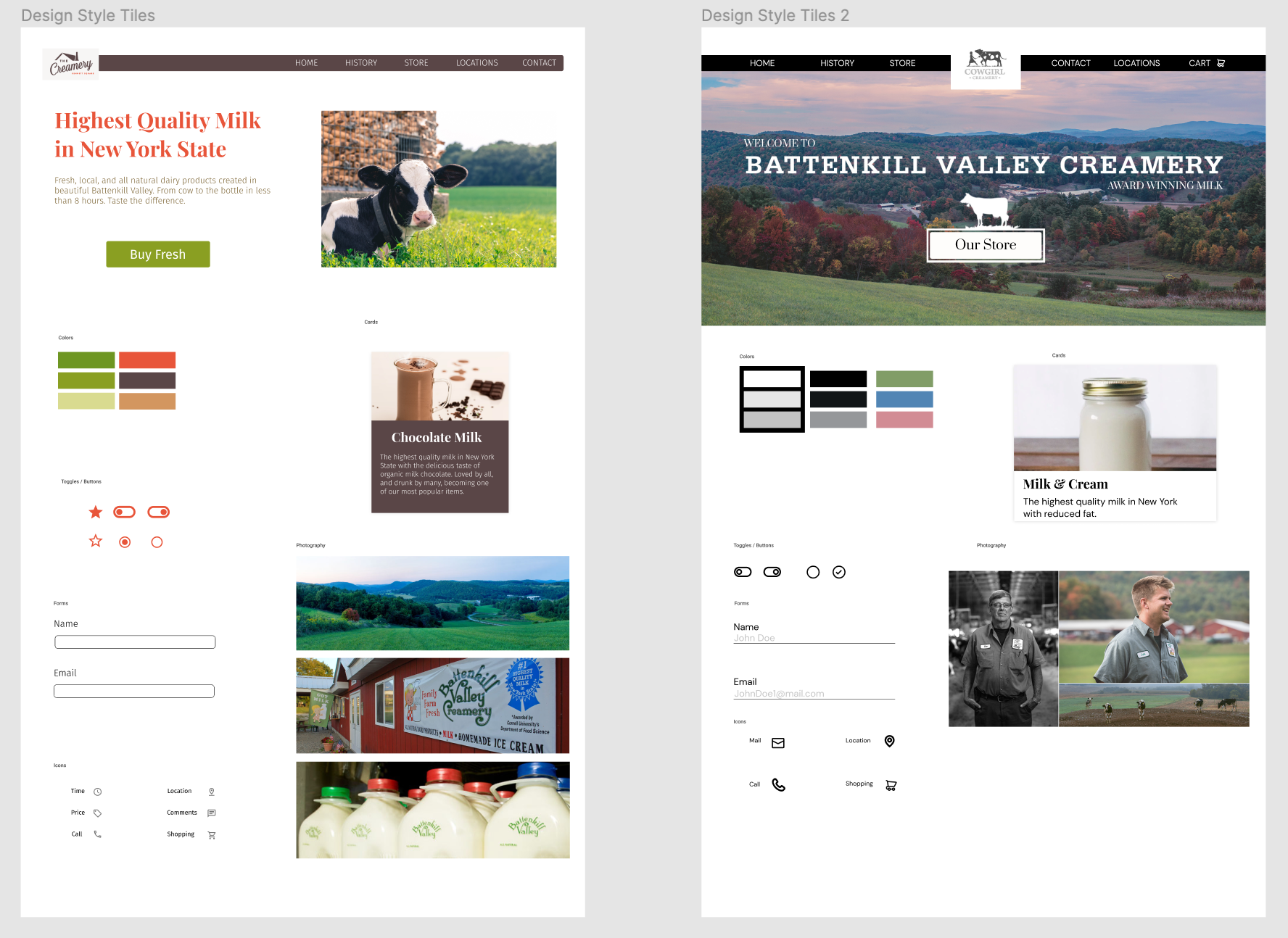
Style Sheets
I drafted two style sheets that were different branding styles. One sticking more to the original logo using oranges and greens to pop out, with a brown for navigation and tiles to. The other style was a more modern and elegant black and white with serif text. I got a lot of feedback and opinions about my. two design styles, strongly opting for a black and white branding. Which received a lot of compliments and support.
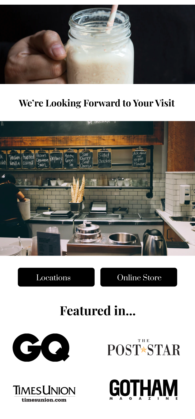
Solutions
-Make a mobile and desktop design for different devices.
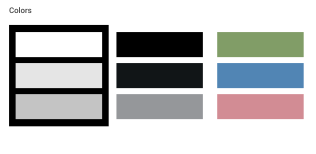
-Use a black and white color scheme for a clean modern feel associated with dairy cows.
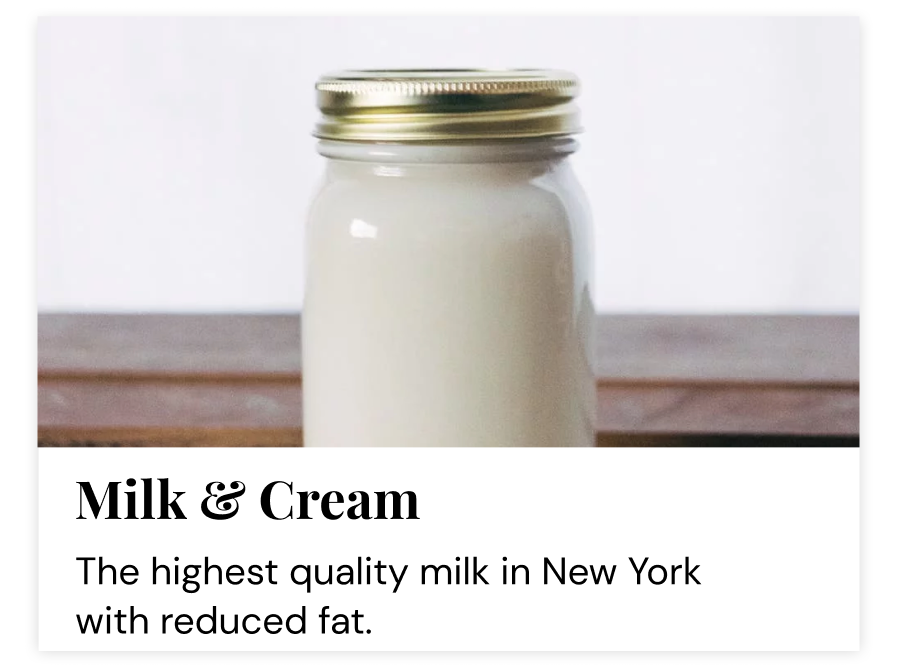
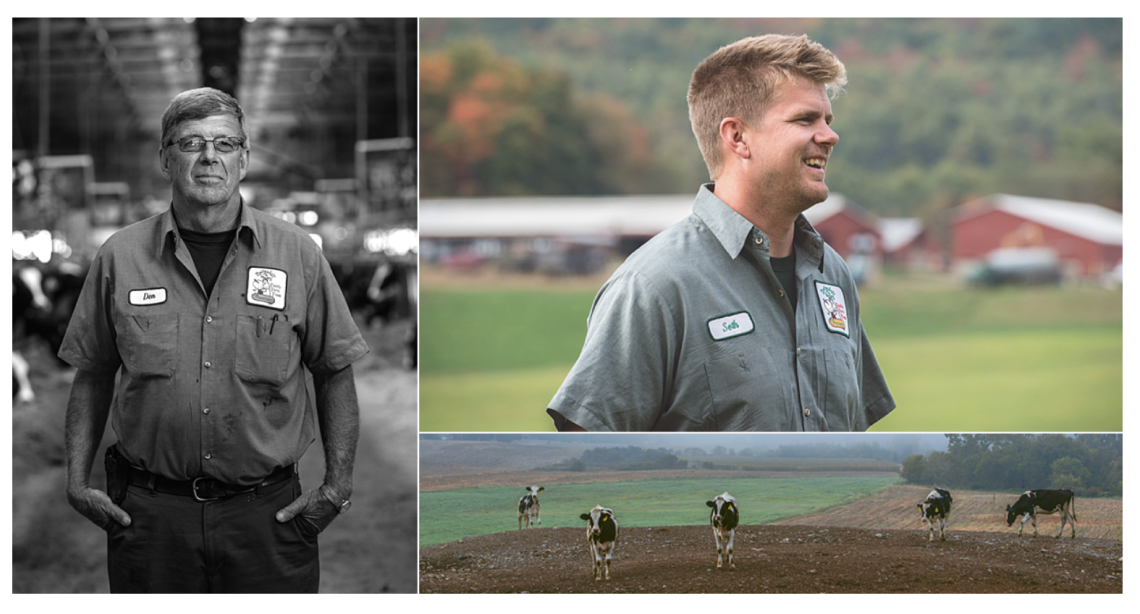
-Use bold photography to sell product and create a feeling of beauty for farming and food.
-Create a user journey to encourage easy purchasing of products.
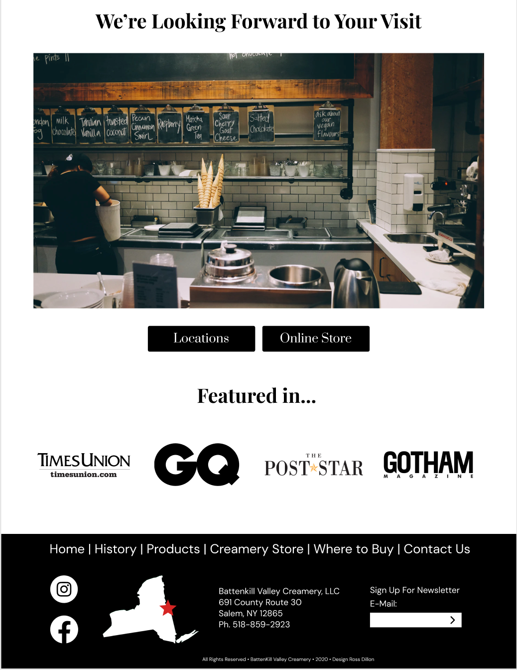
-Call to action on landing page to the shop.
-Build rapport through a family story and "As seen in" section
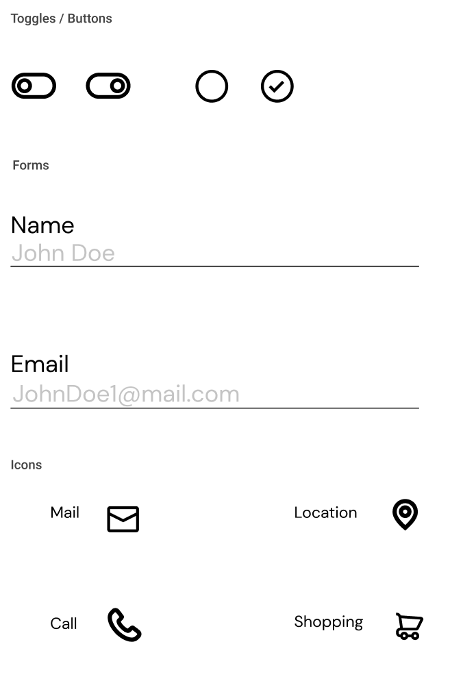
-Use easy to understand icons, and text.
-Make filling out forms easy with example text.
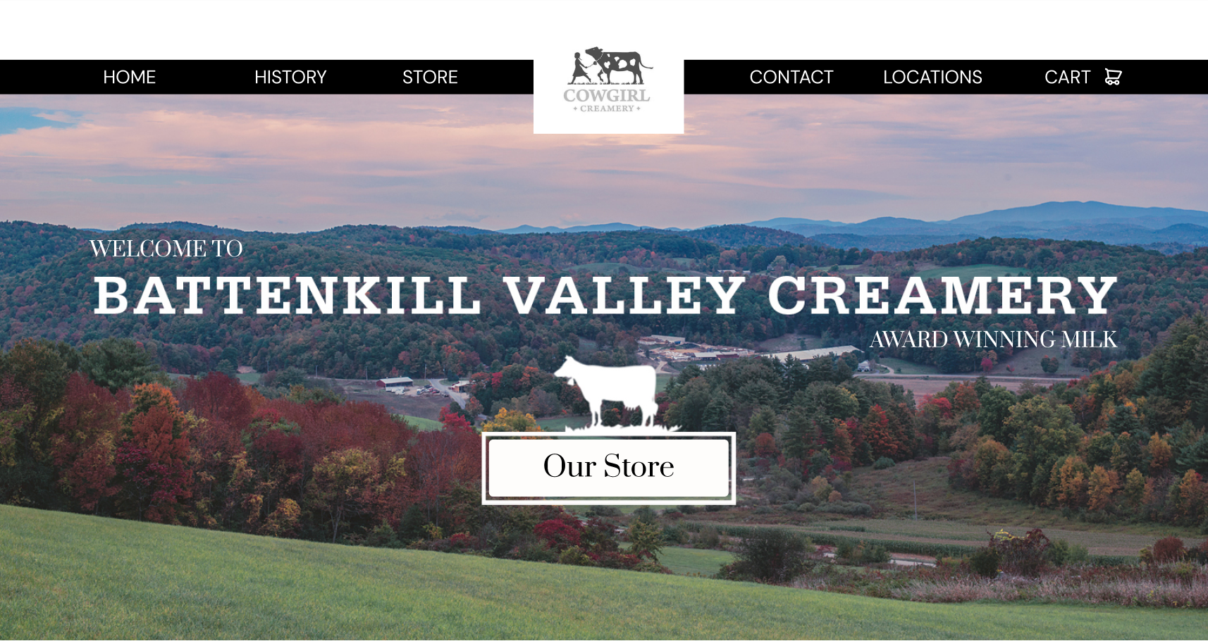
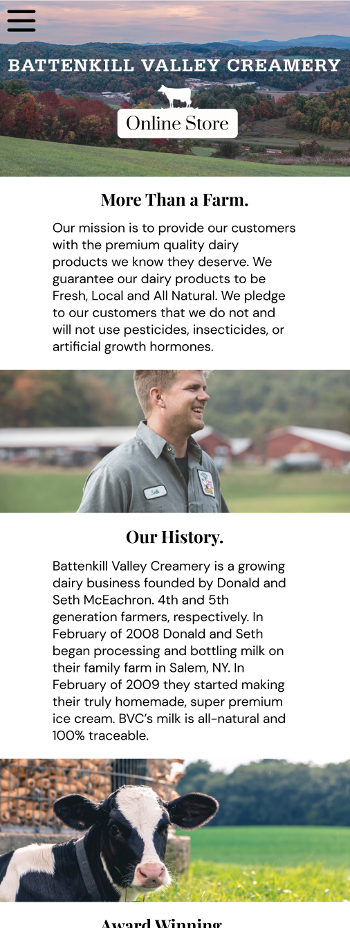
Desktop
Landing Page

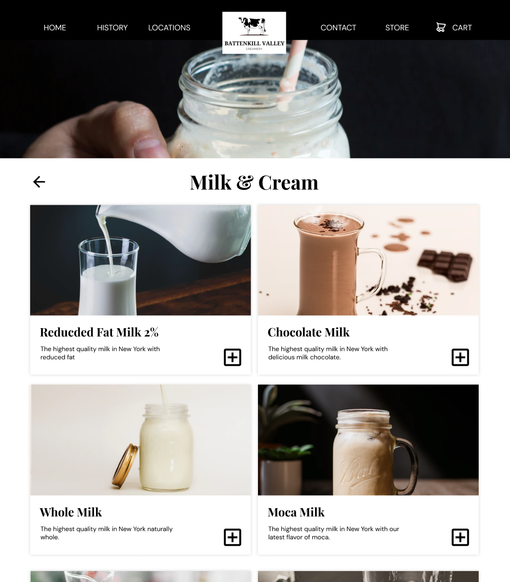
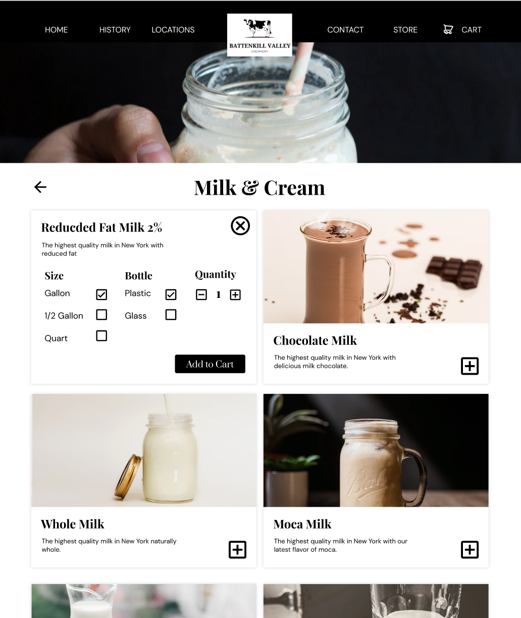
Product Pages
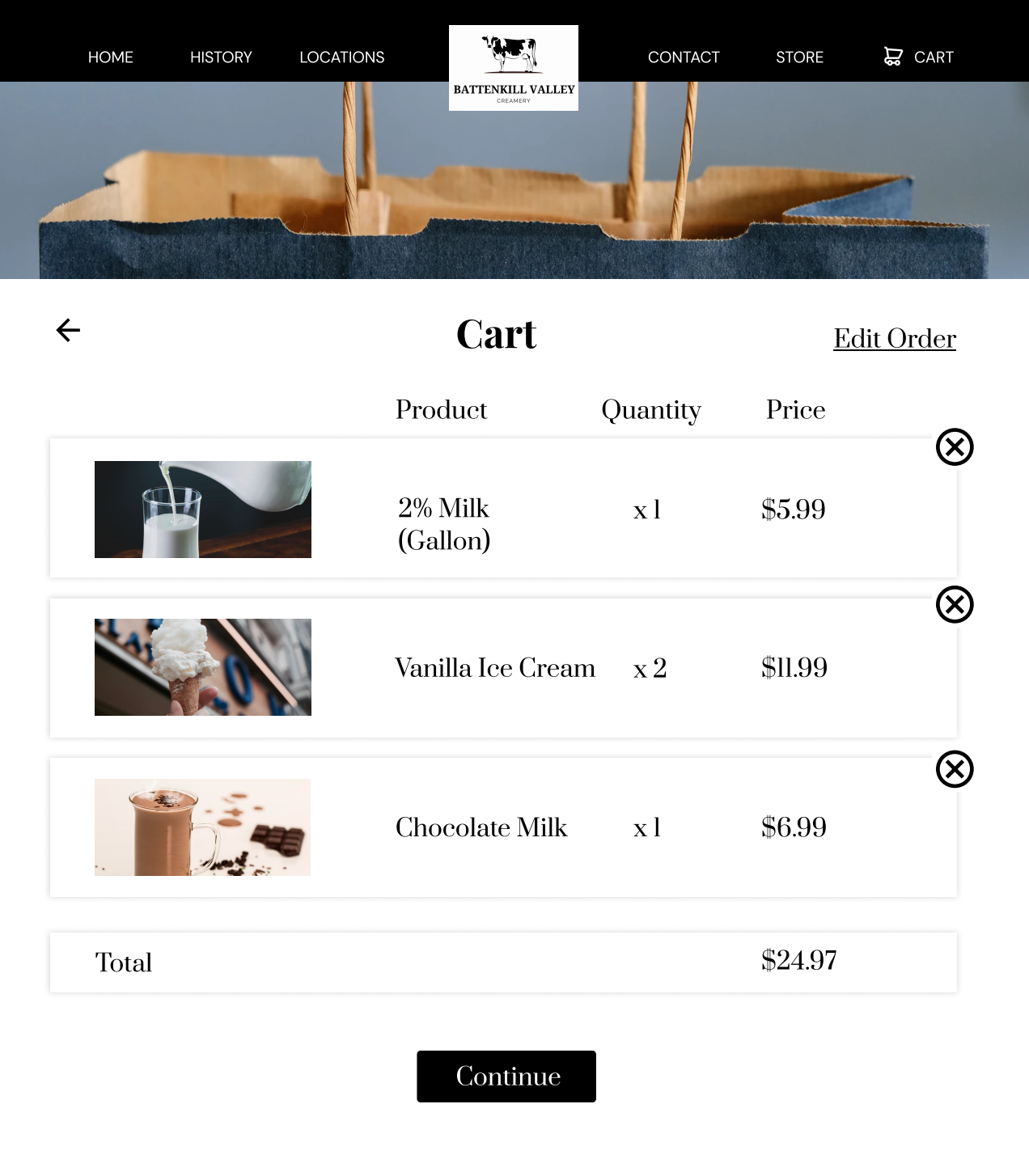
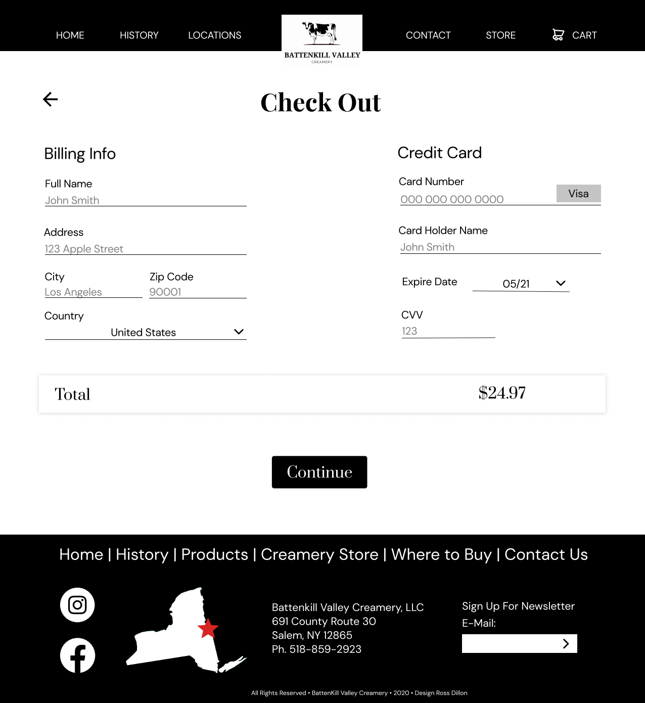
Cart & Checkout Page
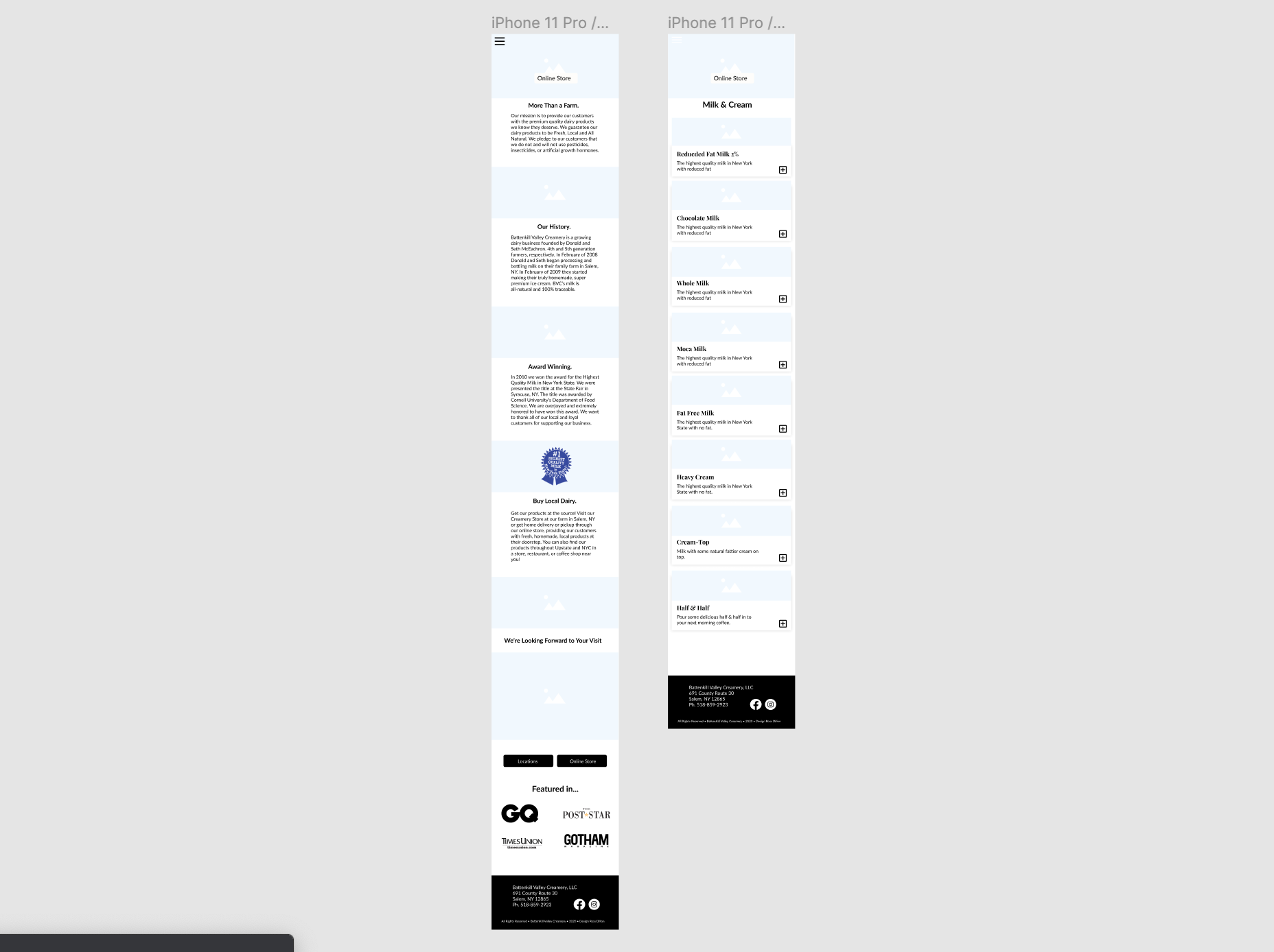
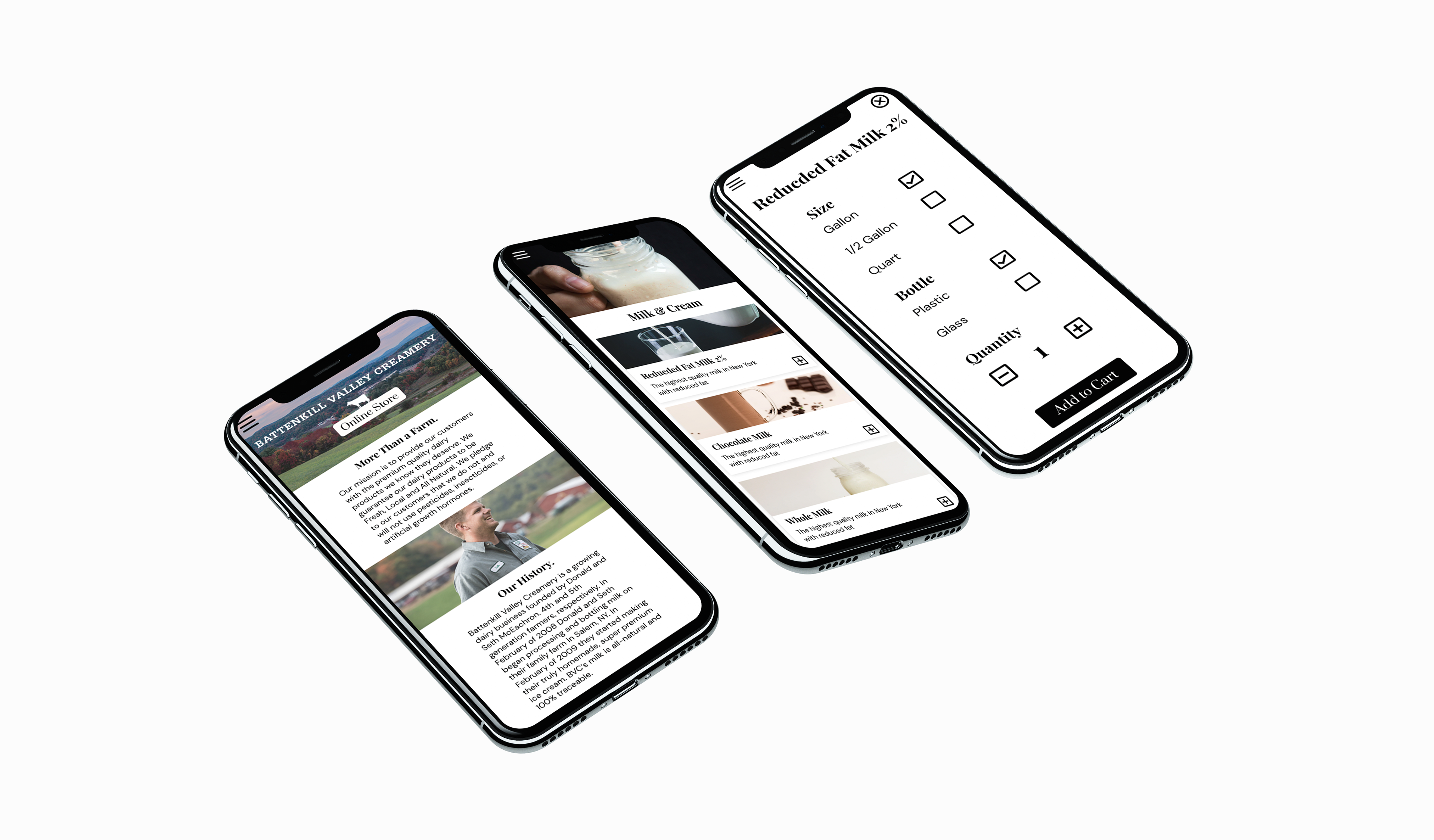
Mobile

In Conclusion
It was important to ensure that the experience on the website is valuable for the costumer. I wanted to make it easier for the consumer to know how to buy products online or where to find the store. The redesign focuses on usability, modern design, branding, and implementing an online store. A vast improvement over the old site.
Reflection
This project really helped me improve my prototyping and wireframing skills. I went paper sketches, to an outline in Figma, to a fully functional prototype for both mobile and Desktop just using Figma. I got a lot of good feedback from classmates who enjoyed the final design iteration. This project definitely helped me with visual and UI design.
Special Thanks to everyone in ISM for the design feedback.